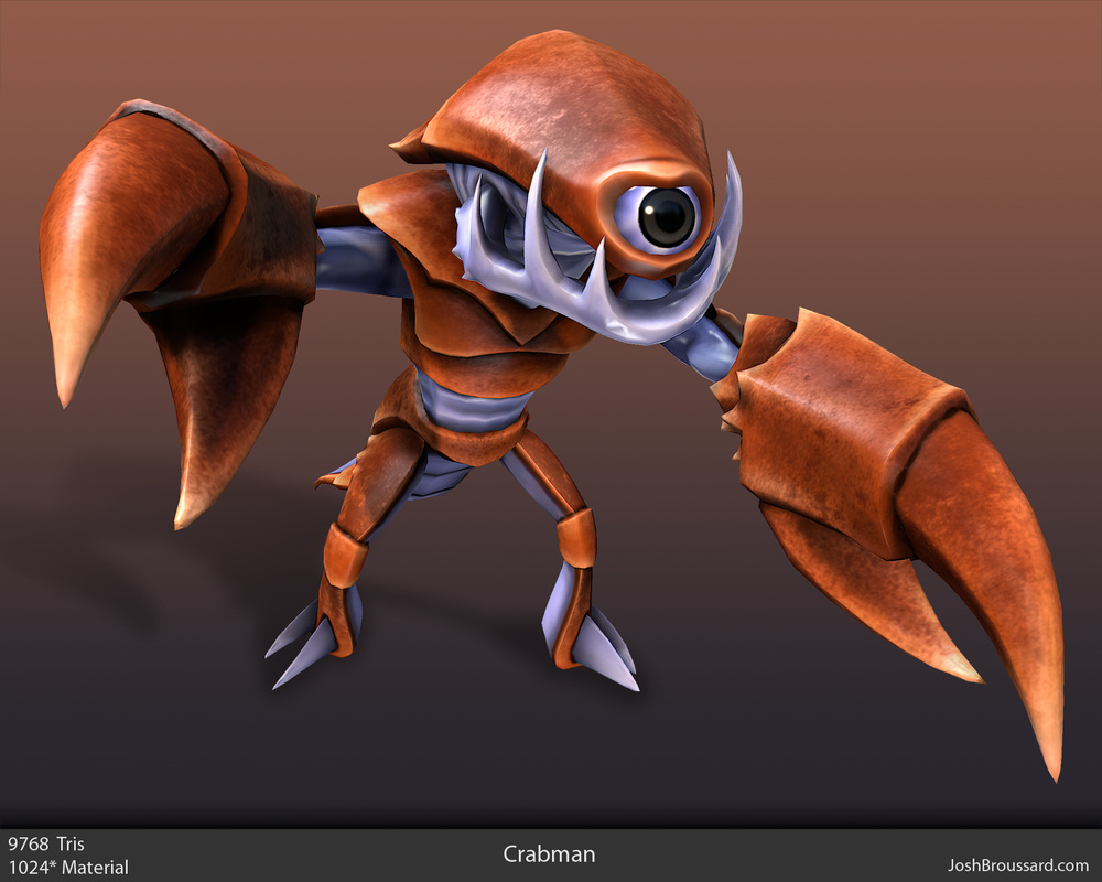
This page is an analysis of re-designing a character,
|
|
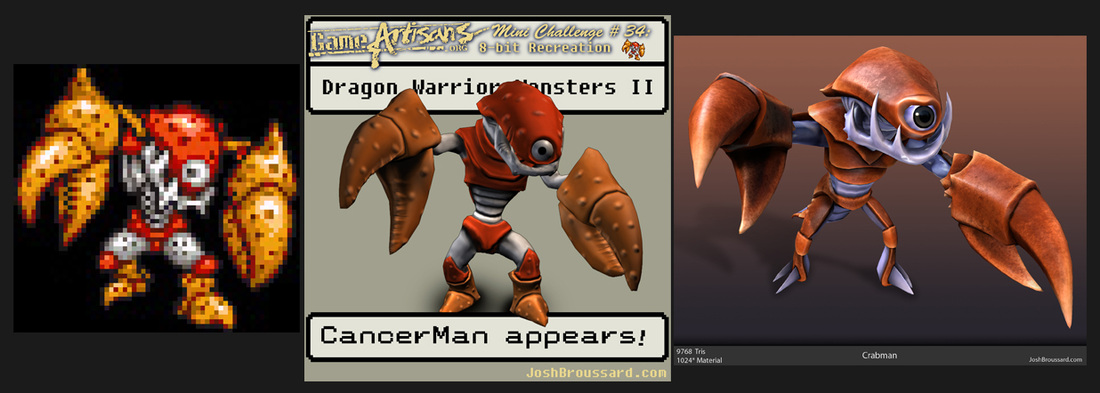
A couple years ago I tried out an "8-bit Challenge" on GameArtisans. The goal was to recreate a pixelated 2d character in 3d. I plan on explaining my design process from that original entry to the much better remake. This time, however, the focus is on making the character my own rather than matching the sprite. |
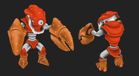
Let's take a look at the original Cancerman: |
|
Okay, a number of things stand out as really awkward right away. First off, the way this character is currently built is very front-heavy, and makes little sense.
So my first task was to restructure his form, while retaining key features. I identify the key features of this character as:
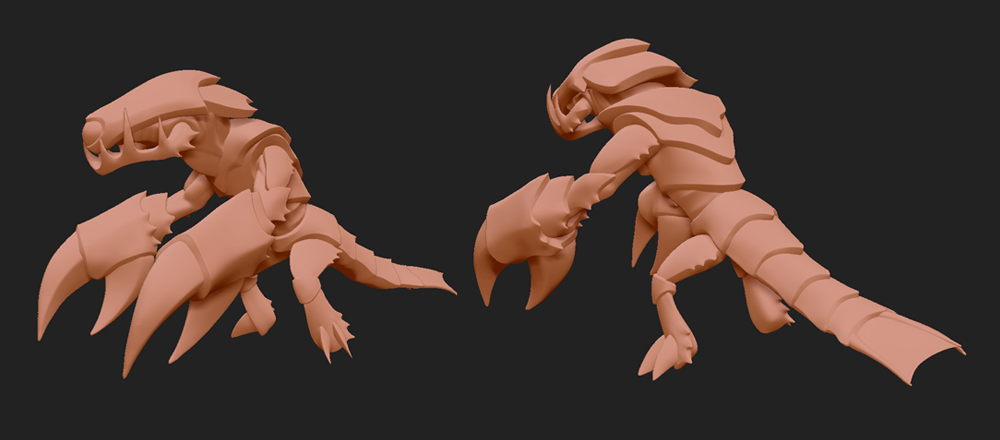
With the focus being so top-heavy I decided that I could take liberties on his lower half. A tail to counterbalance the claws, thinner legs emphasizing the claws/upper body further, and a more forward tilted waist and torso. I then quickly made a blobby puppet in Zbrush and played with the form until I was much happier with him. |
|
Things to take note of at this point are the more slanted legs and the addition of the tail. These changes were twofold beneficial:
|
|
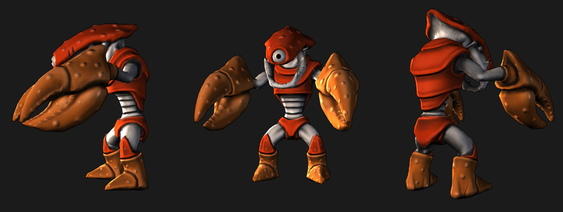
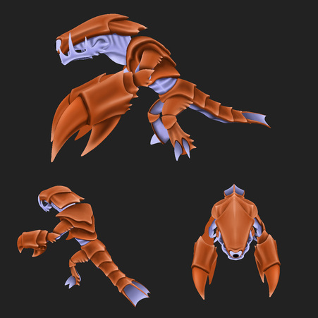
On that note, lets discuss camera angles.
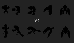
When designing a character, especially for games, the potential camera angle can drastically affect the effectiveness of the design. The (negative) results of this can be seen in how my original CancerMan looks okay from the front, but from a side view looks silly. Similarly a top-down camera (like an RTS game) means that the character must read from far away, full-round, from above. As you can see to the right, the new character is always identifiable due to the claws being tilted differently, the tail, and the hunched figure. In all instances at least two of those are visible, with the bottom-right being the hardest to identify. The solution to that angle is solved later with color. (The visible tip of the tail is an identifiable pale blue white as opposed to the orange of the head.) |
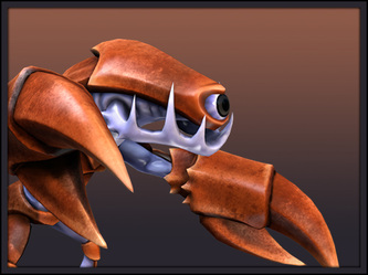
And a look at the final Crabman sculpt: |
|
Lets talk positives of the details on this sculpt vs the original:
|
Lets talk color: |
|
The next big thing to tackle is color. Two decisions were made almost immediately:
|
|
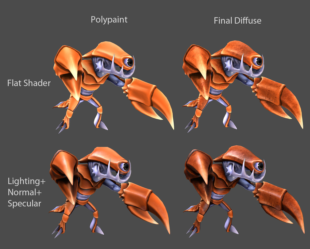
Polypaint on Flat Shader
|
To the left is the polypaint shown on a flat shader. My mentality whenever doing a polypaint to use as a base like this is to think of miniature painting. I used to play tabletop games, and loved to paint the figures. Pick a pallet that includes a core color, shadow color, and highlight color and just keep pushing until every part of the form is readable on a flat shader. Doing so makes the forms pop even more once lighting is introduced again. Below is the flat polypaint of the original Cancerman, for comparisons sake. |
|
This is literally when progress ended on the original Cancerman. The flat polypaint was applied as the diffuse with a normal and a pretty underused specular. The updated Crabman needed more visual interest than just the flat polypaint though. The color shifts were pushed further using subtle brown-to-red-to-yellow-to-orange gradients on top of the painted lighting from before. After that I went over the entire model to add color noise that would be readable at a distance while still looking clean up close. |
And there we are! |
|
Thanks for taking the time to read over this! - Josh |
